
07899 756585
Jane’s statement seem ridiculous – how can most people be better than average? Using some mathematical trickery, here’s how she could be logically correct.
MONDAY: Suppose Jane is in a class of just ten students. On Monday, Jane’s teacher gives the class a test of ten questions. Here are the results:
1, 2, 3, 4, 5, 6, 7, 8, 9, 10
How would you work out the “average” (typical) mark? The correct average to use in this case is the Mean: you add all ten scores up and divide by the number of scores, so:
Monday’s mean = (1+2+…+9+10)/10 = 5.5. Unsurprisingly, half the class were better and half the class worse than average.
TUESDAY: On Tuesday Jane’s teacher gives the class another test, but this time it’s a real stinker. Here are Tuesday’s marks:
1, 1, 1, 1, 1, 1, 2, 2, 5, 9
Jane scores 2 out of ten and feels quite pleased to have come in the top half of the class (despite Clever Claire scoring 9 out of 10). But when she calculates the average score, she’s dismayed to find that:
Tuesday’s mean = (1+1+1+1+1+1+2+2+5+9)/10 = 2.4. Jane came equal third but still did worse than average!
WEDNESDAY: On Wednesday, Jane’s teacher gives the class one further test, but this time she’s passes out the previous year group’s test by mistake – easy for Jane and (most of) her classmates. Here are Wednesday’s scores:
0, 1, 8, 9, 10, 10, 10, 10, 10, 10,
Jane scores a disappointing 8 out of ten – but is delighted when she calculates the average mark for the class:
Wednesday’s mean = (1+5+8+9+10+10+10+10+10+10)/10 = 7.9. Despite coming third from bottom, Jane can still tell her father that she did better than average!
So how is all this possible? The problem here is that the data for Tuesday and Wednesday are both very skewed: positive skew on Tuesday and negative skew on Wednesday.
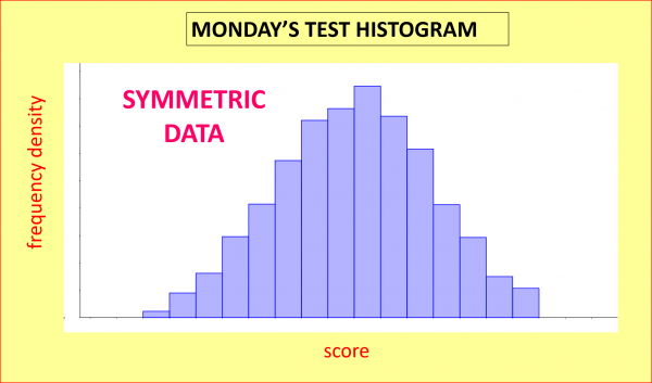
SKEWNESS: let’s now give a test similar to Jane’s Monday one to 1000 similar students instead of to just ten. If we allocate the resulting scores into different groups (depending on the marks scored) and count how many students are in each group, we could illustrate the shape of how the data is distributed with a histogram like this one; as we can see, the graph is reasonably symmetric (technical terms in bold!):
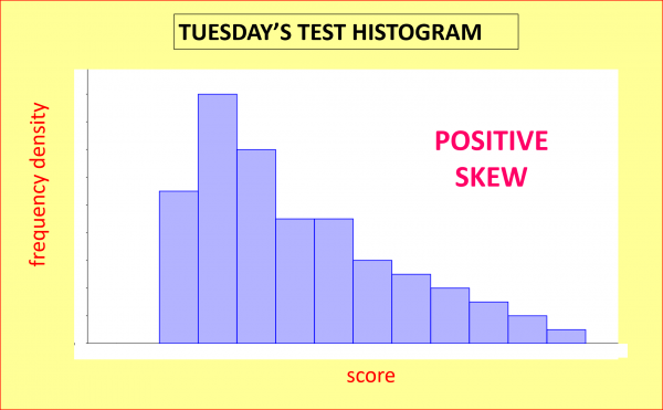
But Tuesday’s test was beastly hard, so if we gave a similar test to a large group of similar students, the histogram of the results might have this sort of shape; this time the data shows positive skew, as is evidenced by the long positive tail:
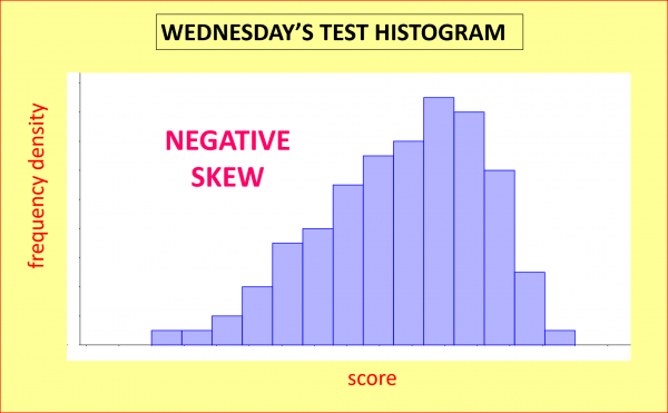
Finally, Wednesday’s test was very easy, so if we gave a similar test to a large group of similar students, the histogram of the results might look like this graph; this time the data shows negative skew, as is evidenced by the long negative tail:
MEAN VERSUS MEDIAN: for skewed data like the tests for Tuesday and Wednesday, the best average to go for is the median rather than the mean. To calculate the median, just put all the data points in numerical order and choose the middle one. In this way you can be assured that half the values will be smaller than (or exactly equal to) average, and the other half will be bigger than (or equal to) average.
ADULT WAGES: a great example of positive skewness is adult wages: according to www.gov.uk the median average wage before tax in the UK in the 2015-2016 tax year was £23,200, but a small number of ultra-high earners distorts the mean, increasing the mean “average wage” to £33,400: a whopping 44% higher than the median. For this reason, the media commonly reports the median rather than the mean wage. You can imagine how depressing it would be if the mean was reported: in 2015-16 for instance, 71% of us earned less than the mean wage (the 71st percentile was £32,900).
HOW MANY LEGS?: most humans have 2 legs, but the small number of humans with fewer than 2 legs brings the mean average number of legs to just under 2, meaning that most humans have more legs than average – but only if you use the mean rather than the median. Another example of negative skew is birthweights of newborn children: in this case, the small number of babies born prematurely means that most newborns weigh more than average (again the apparent paradox is resolved if we use median rather than mean).
SUMMARY: Prime Minister Benjamin Disraeli is supposed to have once uttered the famous quotation: “There are three kinds of lies: lies, damned lies, and statistics.” Leaving aside whether he ever said these words, we can see now how statistics can produce counter-intuitive results such as Jane’s but with a clear conscience.
[mc4wp_form id=”399″]